Whishlist is an e-commerce mobile application that creates an intuitive, seamless, and efficient user experience. By offering personalized product recommendations and suggestions, it helps users find what they’re looking for quickly and easily. Clear category hierarchies, filters for price range, brand, customer ratings, and other relevant parameters will assist users in narrowing down the options.
CHALLENGE
The main problem or challenge faced by an e-commerce app is a high rate of shopping cart abandonment. Many users add products to their carts, but fail to complete the purchase, resulting in lost revenue for the app. The existing user interface and user experience might not be effectively guiding users through the buying process, leading to frustration, confusion, or lack of trust in an e-commerce platform.
USER PERSONA
Martha Thompson
AGE
EDUCATION
STATUS
OCCUPATION
LOCATION
TECH LITERATE
36
Masters in Business
Single
Marketing Manager
Timișoara
Moderate
I am used to online service and I usually do my online shopping from Emag
Personality
Introvert
Thinker
Bio
Martha enjoys online shopping for convenience and time-saving purposes. She frequently uses e-commerce apps to purchase various products, including clothing, electronics, and home decor. She values a seamless user experience, quick delivery, and personalized recommendations.
Core Needs
Need to find relevant results of her product searches
View personalized recommendations, and search filters
Find an e-commerce app that is optimized for mobile platforms with responsive design
Frustrations
Too many and irrelevant results when searching for products, leading to confusion and waste of time
Not finding personalized recommendations, and search filters that can help her find the right or new products and save time
Unfriendly e-commerce platforms interfaces that aren’t necessarily optimized for mobile platforms
Payment
Digital Payment
Platform
Mobile App
USER FLOW
Ideate phase
I created a Flow using Miro to illustrate how the user will navigate through the Whishlist app
DESIGN SYSTEM
The design system aims to provide a consistent and visually appealing experience across all screens of the mobile app. It includes the following key components:
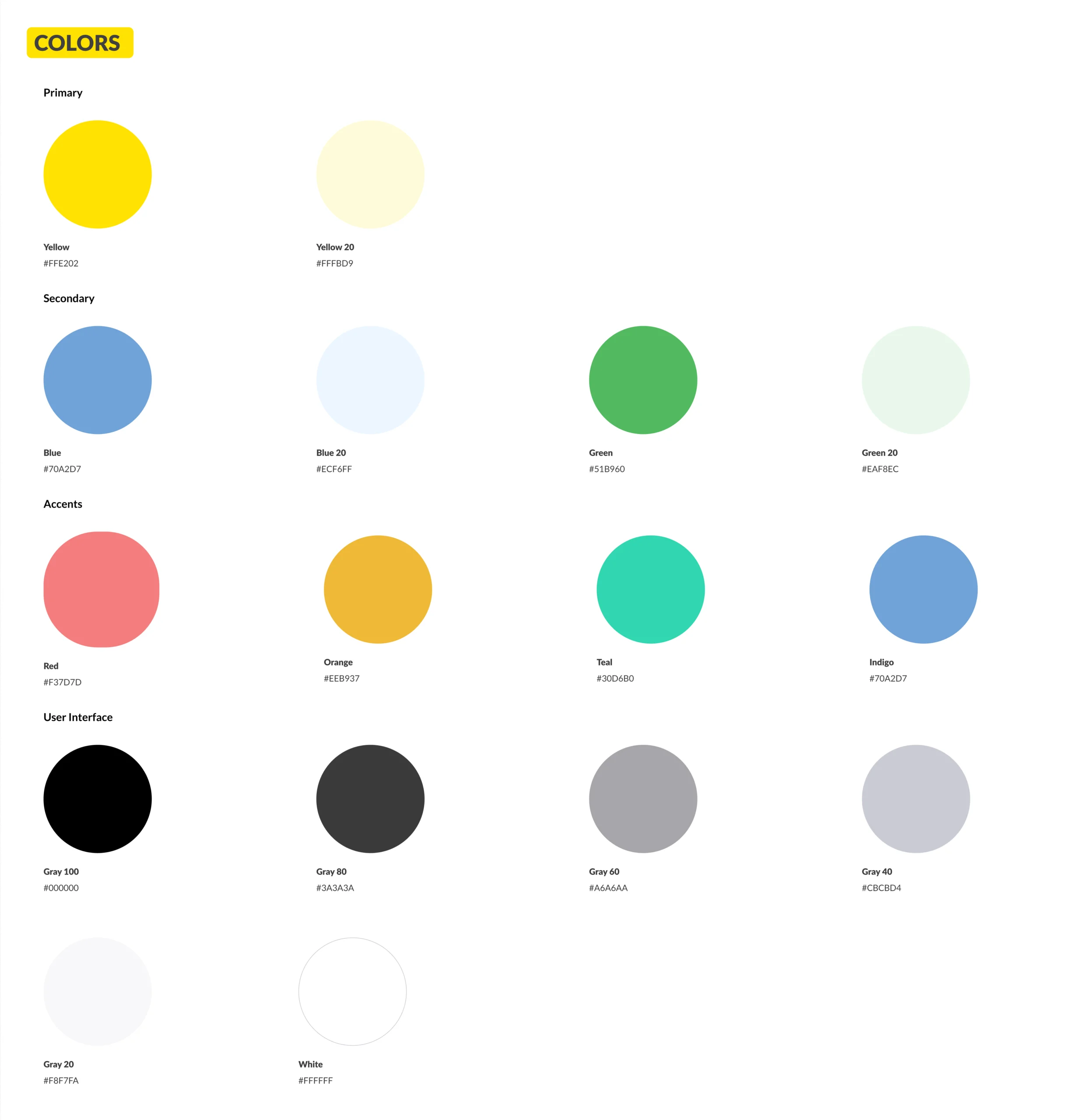
Colors
I used a clean and modern color palette, primarily consisting of soothing yellow, blues, and accent colors to highlight important elements like buttons and icons. Typography
I employed a legible and friendly sans-serif font to ensure readability and trust. Icons
I used a custom set of icons designed to represent actions and categories consistently throughout the app. Layout
A responsive and flexible grid system ensures the content adapts seamlessly to various screen sizes.
WIREFRAMES
Design phase
Wireframes play a critical role in the design process. They help in visualizing the structure and layout of the Product Details Page before investing in detailed design and development. Wireframes also serve as a communication tool between designers, developers and stakeholders.
LOG IN/ SIGN UP
HOME PAGE
PROFILE/ FILTERS/CATEGORY
A simple design is essential for responsiveness and ensuring that the app works smoothly on different screen sizes.
Faster Load Times Streamlined design often leads to faster load times, which are crucial for retaining user interest and preventing drop-offs. Brand Image A clean and trustworthy design reflects positively on the brand, indicating professionalism and reliability. Search Option A prominently placed search button at the top-center of the screen, allowing users to easily initiate product searches. Filters Filters are organized logically, with options for sorting by relevance, price, popularity, and more. I designed sliders, checkboxes, or dropdown menus as I find them appropriate for this type of app. Sorting Options I tried to provide a clear sorting option to help users refine their search results.