The primary goal in every project is to design logos that not only capture and reflect the true essence of the brands they represent, but also resonate with audiences on a deeper level, ensuring that they leave a lasting impression.
I believe a well-designed logo is more than just a symbol—it’s a powerful representation of a brand’s values, mission, and identity. By working closely with clients and understanding their vision, I strive to create logos that stand the test of time and effectively communicate the core message of the brand to its target audience.
RESOUND
2024
The Resound logo is all about clean, modern design with a subtle yet powerful nod to high-quality sound.
Using a minimalistic font, it keeps things professional while letting the name shine. The real standout feature is the letter “o,” transformed into a horn speaker symbol — a direct tribute to the Funktion One speakers the brand specializes in.
UNIUNEA CENTRULUI CULTURAL
Regiunea Vest
2022
This client is an institution that aims to organize various cultural events and develop the cultural sector in the western region of Romania.
The symbol created has the accent on “U”, from “Union” , and the idea of cultural centre is represented by a kind of portal. I used the specific colour of the creative area – purple, and blue for a trust-feeling.
SOCIETATEA ROMÂNĂ DE PATOLOGIE VASCULARĂ
2023
The client is the founder of the Romanian Society of Vascular Pathology and wanted a logo that combined the three main components of veins, each with its specific colour.
I chose a serif font to give a touch of elegance and formality. The symbol is a circular shape that inspires confidence and friendship, which incorporates a few squares that, in my view, points to an institution.
EFFICIENT SOLAR
2022
The client is a solar panel supplier and wanted a symbol specific to the business, so I incorporated a sun and an arrow denoting efficiency, along with a sans serif font to make the logo more minimalist and modern.
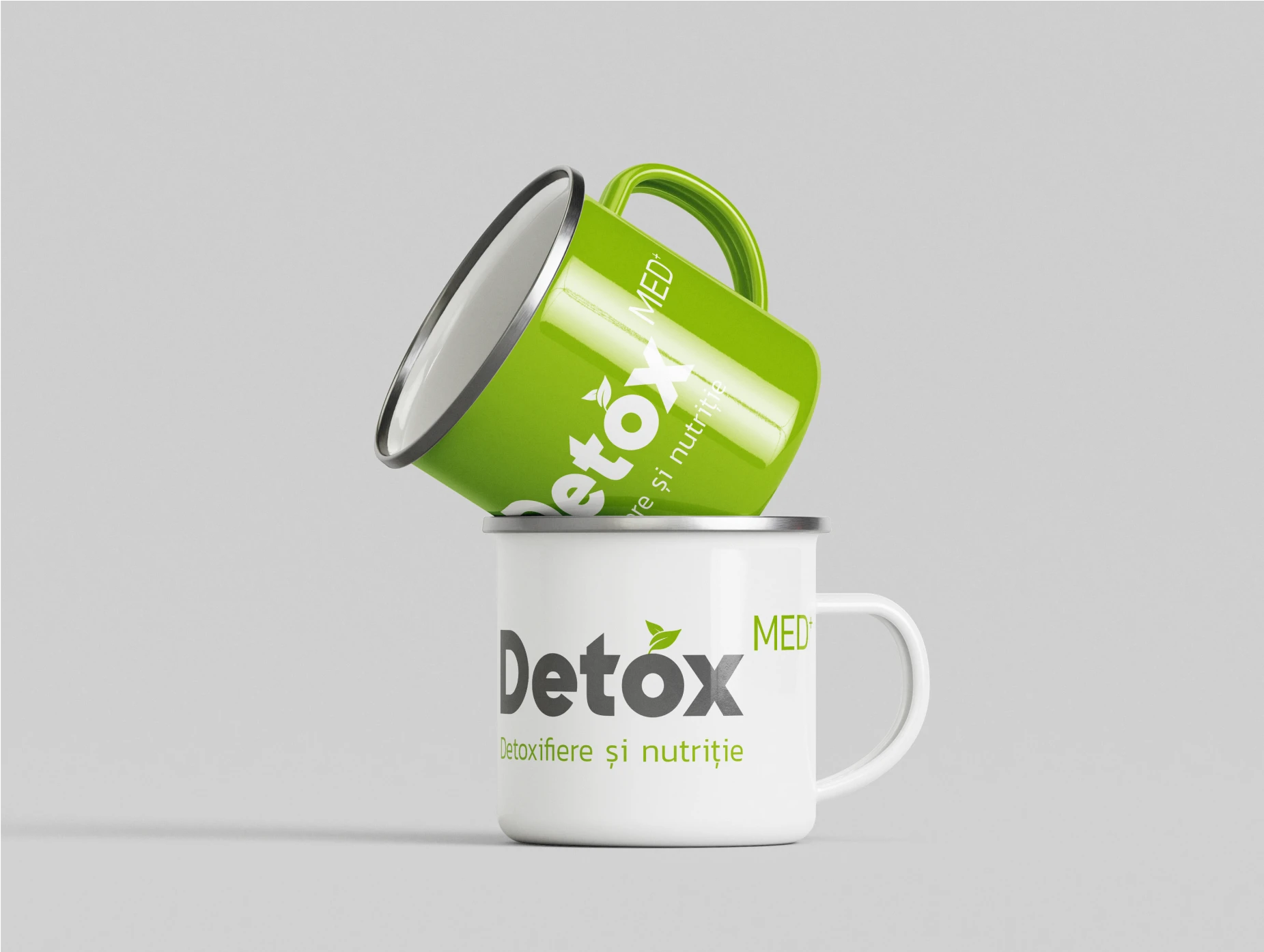
DETOX MED
2021
The client’s business is part of the health industry and promotes healthy lifestyle by marketing mainly raw and cold-pressed juices and organic salads for detox purposes.
I chose healthy green for the logo which, together with the grey, emphasizes the health area of the business. We added a leaf above the “O” to illustrate a fruit to further reinforce the customer’s vision of detox.
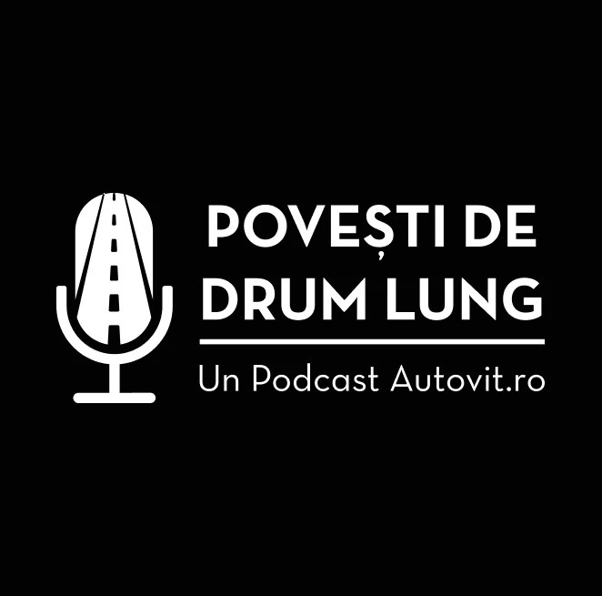
POVEȘTI DE DRUM LUNG
2023
Autovit.ro, the largest car classifieds website in Romania where you can find thousands of ads with new and used cars for sale, requested a logo for their podcast.
The logo is designed from a symbol composed of a microphone and a road embedded in it to reproduce the idea of long road stories, which is the name of the podcast. I also designed a few print materials.